
As a marketing professional, I’ve subscribed to a wide selection of email lists. Some of the emails I receive are excellent, but some have evidently landed in my junk folder for obvious reasons.
I’ve decided to share with you a few samples from my inbox to show you what to do and what to avoid, so you can learn from concrete examples (someone else’s mistakes).
Boring subject lines
You should avoid these at all cost. Instead, opt for subject lines that are informative and entice the recipient to want to know more.
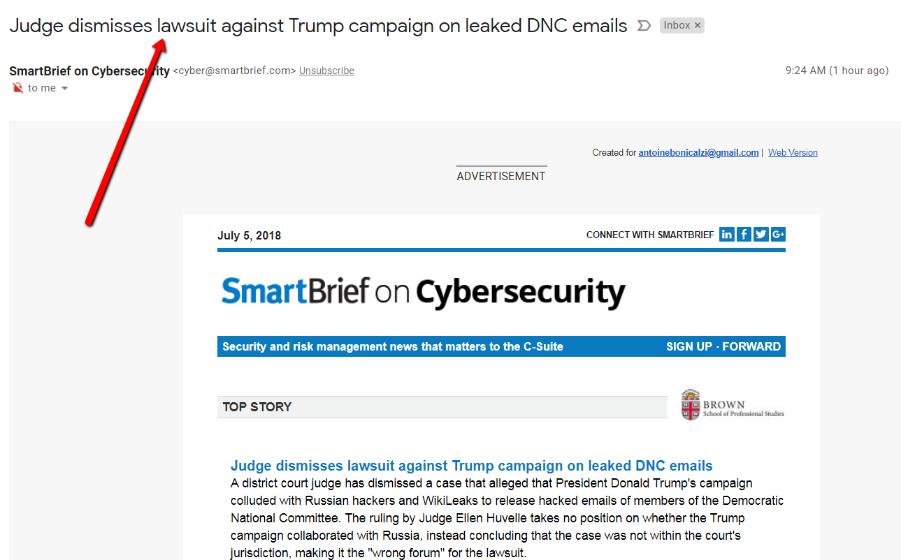
Let’s look at this newsletter, from SmartBrief on Cybersecurity. I receive this type of email regularly: one that offers a few summaries of articles each with a link to the full piece.
In this example they do a great job at avoiding using a boring subject line such as, “Don’t miss this” or even worst “July 5th newsletter”. Instead, they went with “Judge dismisses lawsuit against Trump campaign on leaked DNC emails” – the title of the first article – now that got my attention! It makes me want to open it and find out more.
Now, can we all agree to ditch the boring old “ July 5th newsletter” type subject lines for good?
Not all tactics to increase open rates are good
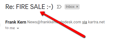
Frank Kern is a well-known American marketer, but I have to admit that sometimes he chooses to use questionable tactics that leave a lot to be desired. In this example, he adds “Re:” at the beginning of the subject line to mimic a conversation (as if he were replying to an email I sent him). At a glance, I know full well that this is a promotional email sent to a list and not a conversation between him and I!
Yes, a subject line needs to entice readers to open the emails you send, but resorting to trickery rarely works. It’ll just give your clients and prospects a bad impression. The key is finding a balance between both concepts.
Useful content first… products second
Sometimes, we have to stop trying to sell for a minute and give our subscribers content they will find useful and informative: something interesting, entertaining or inspiring. That’s exactly what Attitude cleaning products does very well.
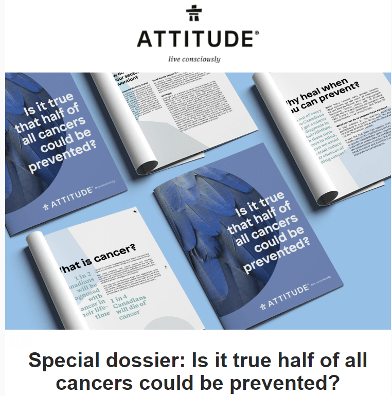
I’m aware that producing content like this demands a lot of time and effort from Attitude. That’s why, when I see this, I feel like they really care about people’s health and wellness. It gives the impression that they are not just trying to sell their products to make money, but because they want to make a difference.
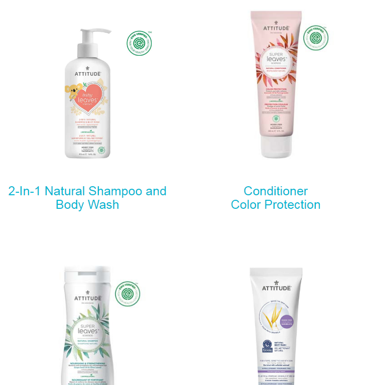
Their products are also featured on the email – very visible, but placed a little lower.
Even if there is no direct link mentioned between the content about cancer (Is it true, half of cancers could be prevented?) and their products (natural and healthier), it’s easy to read between the lines and make the connection between the two. A link they want us to make. Well played!
The email straight out of left field!
People who receive emails need to see right away why you are sending them an email and why it’s relevant for them.
I recently received this email from CheapOAir.ca…
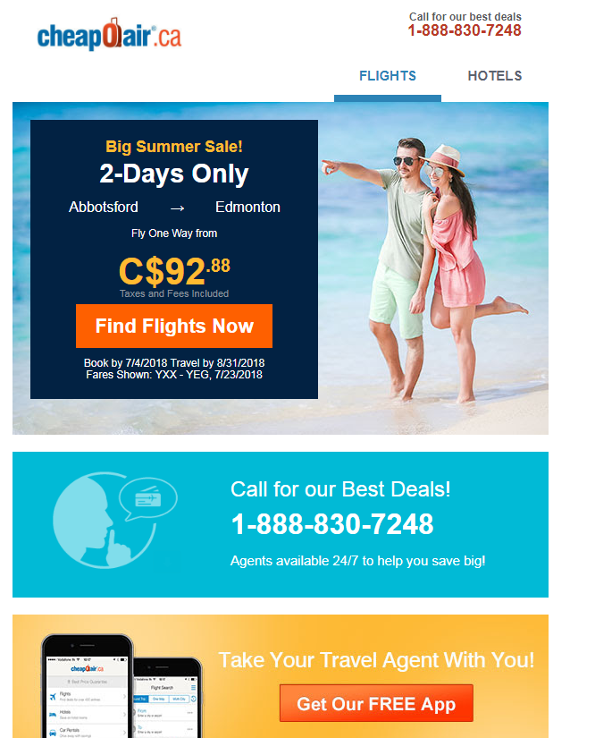
First of all, I don’t live in Abbotsford (where is that anyway?) and I’m not planning a trip to Edmonton anytime soon (not exactly the dream vacation destination I had in mind). We really get the impression that this offer was generated at random. The odds that this will interest me are very low. Plus, just below, there are two different calls to action. You want me to call you, or install your app? I’m a little confused…
Everything you should avoid doing in one email!
I apologize in advance to this company, but this email showcases everything you should avoid.
First off, it’s not pleasing to the eye. Your emails are an extension of your brand, same as your website for example. Your email designs can be super simple, but they should also look attractive. If your email resembles something straight out of the ‘90s, it automatically won’t make a good impression.
I’ve already mentioned subject lines: “July Newsletter”, it doesn’t quite work.
As for the image (I’m thinking it’s supposed to be the logo), it doesn’t appear. We should always test these details before sending our emails.
I’ve never subscribed to their email list and I’ve never been there – it’s an unsolicited email, which means it’s illegal on top of everything else. Let’s not forget that I found it in my junk mail and for good reason.
A white background & a stunning image can do wonders!
Let’s end on a positive note shall we? It’s not hard to choose an attractive, minimalistic design that will make a good impression and make your content pop.
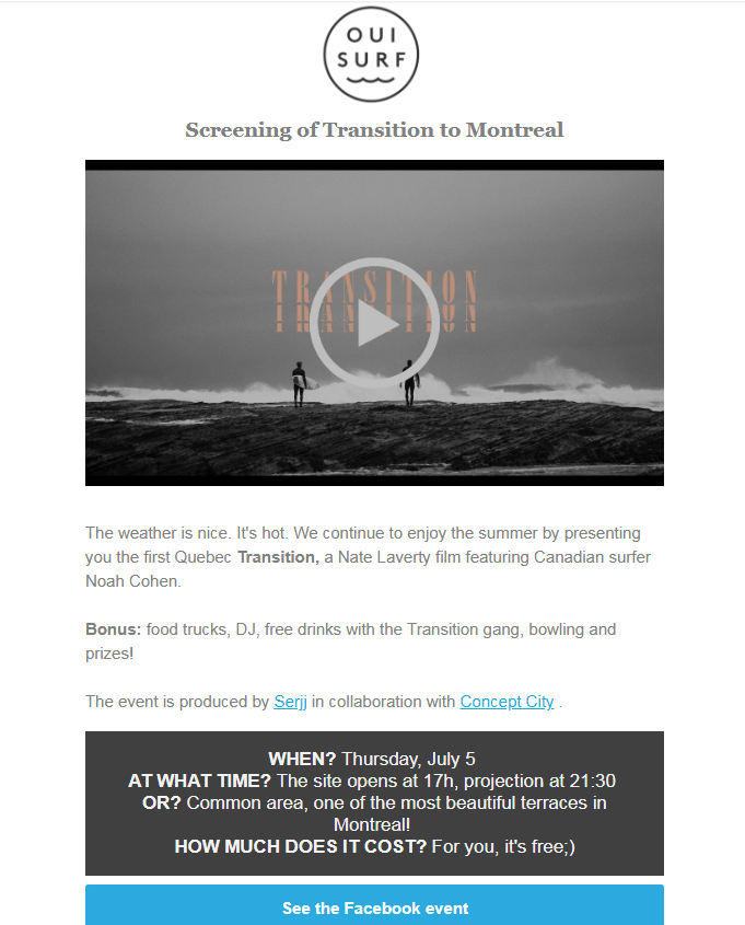
This email extremely effective! A white background, a discreet logo, a beautiful image (when we click on it, we are sent to a YouTube video), the details of the event are concise and easy to read, and their call to action is very clear.
There you have it, the overview of my junk email folder, the good, the bad… and the ugly. Of course with the number of emails I receive we could go on forever, but I hope the examples mentioned will help you send more effective emails, and give you better results.
Looking for an excellent email marketing tool to execute your strategy? Not using Cyberimpact yet? Create your free account now!