
One might assume that writing an email and creating its design would be child’s play. As you may have noticed while planning your campaigns, sometimes it’s a little harder than you might have imagined. Nothing is more frustrating than spending hours in front of your computer screen trying to create your perfect layout, only to realize that it looks completely distorted in your mailbox or on your phone when you’re testing it out.
What you may not know is that just a few details in the way you create HTML emails could be the source of your frustrations. The good news is these issues are not hard to resolve at all!
Here are four mistakes (or bad habits), you want to avoid if you want to make sure that your email design and layout are intact in almost all email software and mobile platforms your subscribers might use.
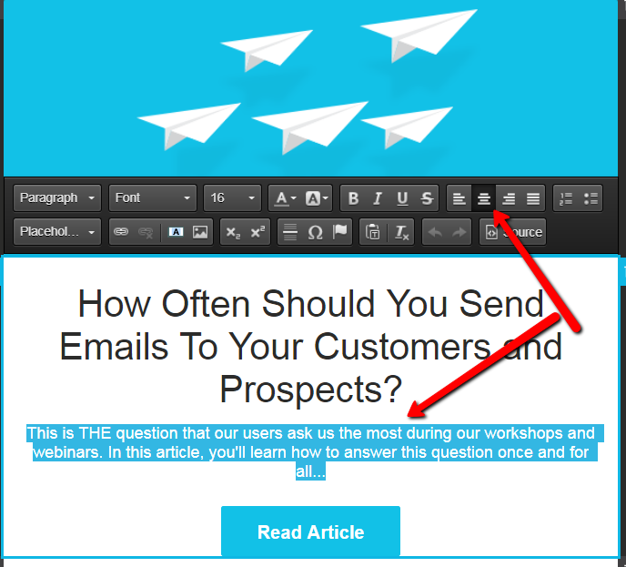
1. Centering Your Content: Stop Using the Space Bar!
It’s a fact, centering your content provides an interesting visual effect to a piece of writing. However, when using HTML email editors (such as Cyberimpact), it’s important to use the right keystrokes to get there. Whatever you do: Don’t use the space bar to “push” along the text to the center. What you don’t see when you repeatedly press the spacebar, are the series of invisible, non-breaking spaces that you create and add to the HTML code of your email. Since non-breaking spaces should not be broken, email software or mobile platforms force them to stay on the same line, which can break up your layout by adjusting it to the alignment. Your layout will no longer make sense and you will be frustrated time and time again with the end result.
Instead, what we recommend is that you select your desired text and click the appropriate button to center your content.
It’s also a lot less of a headache for you to do it this way!
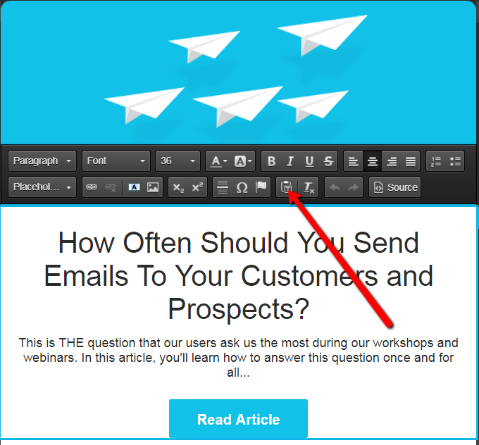
2. Using Copy / Paste
We know, it can be very tempting to save some time, and do a simple copy and paste to add your written content from a program such as Word into the body of your email (in Cyberimpact or another email marketing platform). The problem with doing this can be twofold, one, you run the risk of pasting something that is possibly not supported by the HTML code and two, you may paste something that will break in the email software of your readers. Why does this happen? Because it is very likely that you are unknowingly importing some formatting code. You don’t see it. At first glance, everything looks perfect…but in contrast, it’s a safe bet to place that some problems will have slipped into the way your email displays to your end users.
The source code of the email will have irregularities by using this time saving cut and paste action. Therefore, the end result is that this makes the layout not conform to your email design. You also want to watch out for pictures and emoticons!An image that has simply been pasted into the body of your email may not be displayed at all to your recipients.
There is a solution to all those issues! If you have prepared your content in Word (for example) and you don’t want to rewrite it all in Cyberimpact, you can simply use the “Paste as plain text” function. You can then paste your content directly into your email campaign, without transferring any formatting issues that could become problematic.
3. Be Careful How You Separate Sections in Your Newsletter
Just like avoiding using the space bar to center your content, using a series of asterisks (*) or hyphens (-) as horizontal separator lines should be avoided since it will create some visual problems for the end user. Amongst other things, the mobile version of your emails will become problematic in terms of how its width is presented to your readers. Instead, we suggest using the tool available in Cyberimpact’s simplified editor which allows you to add a horizontal bar that will follow the width of your text box.
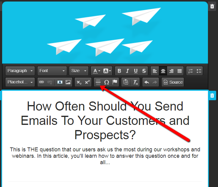
Bonus: In Cyberimpact, this line is responsive when your email is read on a mobile device!
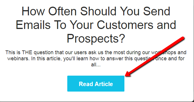
4. Hide Never-Ending Hyperlinks
Some hyperlinks are long. Some are actually way too long. A link will tend to be interpreted as a non-breaking element by some email software or mobile platforms. Yes, we know you don’t have any control over the length of the URL you need to add to your email. But, you don’t have to display the link in its entirety. It’s possible to hide a very long link (or even a shorter link) behind a word, phrase or button. Short and simple phrases that call to action work very well in hiding your long link and they also create an interesting visual element for the reader to focus on.
Click here, download, read more …
You want all your calls to action inviting your contacts to click to be much shorter than: https://www.verylongurl.com/exampleofareallylongurl-which-breaks-up-your-image/868420/article
Creating HTML emails can (sometimes) be a temperamental affair. Which is exactly why it’s important to avoid the pitfalls we just listed. By avoiding them you will succeed in creating a stable visual element, that will be optimal for viewing on both desktop and mobile devices. As luck would have it, Cyberimpact on their email marketing platform have the solutions and tools you need to help you do the job properly and without any headaches. We hope that these recommendations help you build problem free emails for all your future email marketing campaigns!
Happy marketing!
About The Author
 Amy’s passion for marketing, IT and helping people makes her the ultimate Cyberimpact specialist. She is a fantasy junkie and a true wordsmith. When she is not behind her keyboard answering your questions, she’s taking care of her family and working on a novel. You can find more of her work here and follow her on Facebook.