
Every marketing expert knows that pop-up forms can be incredibly effective when it comes to building email contact lists. Whether called pop-up windows, subscription forms, or newsletter pop-ups, the pop-up form will allow you to:
- Collect email addresses from visitors to your website
- Gather information about your subscribers
- Increase your conversions
- Promote your newsletter
- Reduce your bounce rate
Using pop-up subscription forms in your inbound marketing is a good idea, but it’s important to follow tips for success. In this blog article, you will find a complete guide to pop-up form strategies with effective examples that you can easily implement.
Table of contents:
- What is a pop-up form?
- Types of pop-ups
- Locations for a pop-up form
- What are the best practices for creating a pop-up form?
- Effectiveness of pop-ups
- Pop-up form strategies
- Examples of pop-up forms
What is a pop-up form?
A pop-up form is a contextual window that appears automatically on a web page. Often, its purpose is to capture specific user information, such as their email address or preferences. It’s up to you to determine the fields you want to include in the pop-up form.
You can trigger them in various ways, such as by monitoring time spent on the page, observing user behavior, or tracking mouse movement.
Website popups are often used in digital marketing to increase conversions and engage with visitors in a more interactive way.
Types of pop-ups
In the field of digital marketing, there are several types of pop-
up forms, each tailored to specific objectives. Here are some of the most common types:
Classic newsletter subscription pop-up:
Encourages visitors to subscribe to a newsletter, receive updates, or access exclusive content.
Promotion pop-up:
Highlights special offers, discounts, or temporary promotions to incentivize purchases. You can even share a promo code.
Content download form:
Offers downloadable content in exchange for data such as email addresses or demographic information. This could include PDF whitepapers, practical guides, recipe ideas, etc. The key is to provide added value to your visitors.
Event registration pop-up:
Appears when a visitor expresses interest in a specific event on the site. It encourages the user to register for the event by providing necessary information such as name, email address, and other relevant details. This could be registration for a conference, webinar, training, yoga retreat, or group trip.
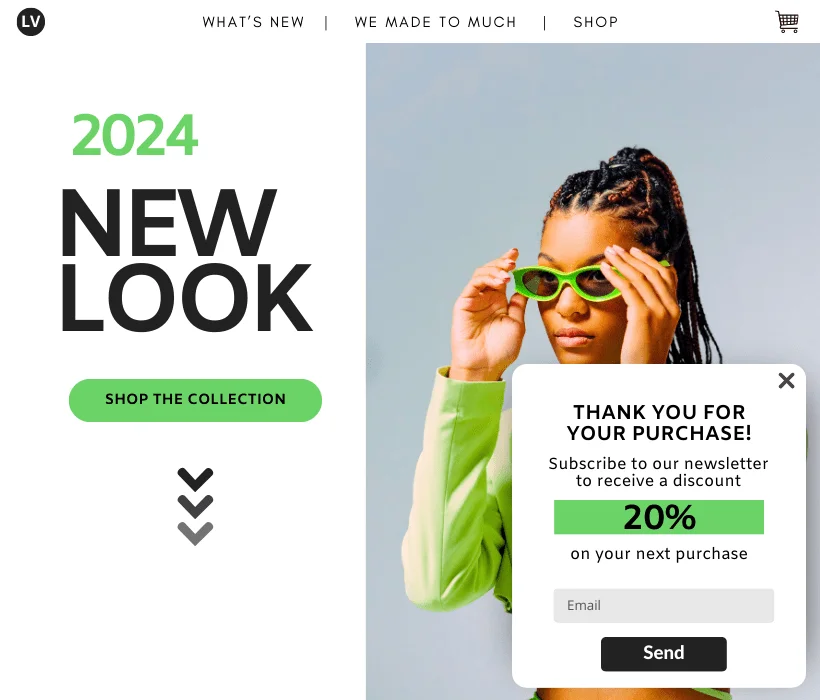
Post-purchase confirmation pop-up:
Appears after a purchase action has been completed, confirming the order and offering a discount for a future purchase.
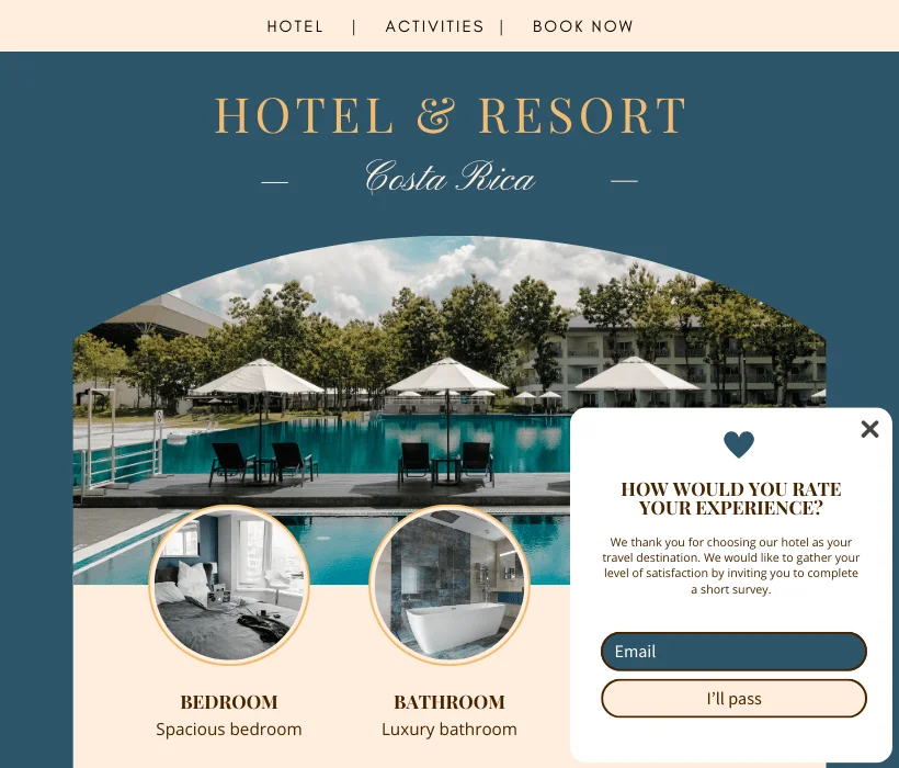
Feedback pop-up form:
Collects user reviews and feedback to improve products or services. This could be a brief satisfaction survey. These are common pop-up forms in online marketing, used to engage and interact with website visitors effectively.
Locations for a pop-up form:
When it comes to creating a pop-up, you have several location options available. The location choice depends on the popup’s goal, visitor behavior, and alignment with the site design. Experimenting with different locations can help determine which one works best for you in achieving your marketing objectives.
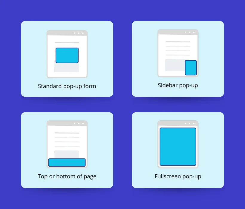
Standard pop-up form
This is the most common type of popup. It’s probably the one you see most often when browsing other websites. It’s a small window that appears over the main content of your web page.
Typically, the background is blurred or darker to draw attention. To close it, you simply click on the ‘X’ or outside the window.
When to use it?
This form works when visitors spend some time on your website. It appears when visitors show a certain interest in your brand. Showing this as an exit form is helpful. The exit form doesn’t appear immediately. Instead, it pops up when a visitor is about to leave your site.
Sidebar pop-up
Sidebar pop-ups are among the least intrusive, displaying discreet messages on the side of the screen. It’s an excellent way to communicate information without disrupting the visitor’s experience on your website. They can be positioned in the lower left or lower right corner of the screen.
When to use them?
A sidebar pop-up form is particularly suitable in situations where you want to communicate with visitors subtly without interrupting their browsing experience. This can be during the reading of a blog post or immediately after landing on a landing page.
Top or bottom of page
The top or bottom of the page popup, also called a “sticky bar” or “floating bar,” is a horizontal bar that appears either at the top or the bottom of the screen. It appears when a visitor scrolls the screen, and typically, the background of the screen does not become blurred or darker. Like sidebar pop-ups, sticky bars deliver a subtle message to visitors.
When to use them?
In general, sticky bars are particularly useful when you want to continuously communicate essential information without disrupting the user experience. They can show important messages without needing the visitor to interact, as they stay visible on the site.
Fullscreen pop-up
A fullscreen popup covers the entire user’s screen, temporarily obscuring the underlying content of the website. Unlike other types that appear in smaller dimensions, the fullscreen version occupies the entire visible area on the user’s screen. It requires the visitor to interact with or close it to continue browsing your website.
When to use them?
Use full-screen pop-ups to get your visitors’ attention and remove distractions so they stay focused. Whether it’s for important announcements, special promotions, welcome messages, or other critical information, it’s crucial to use them sparingly and strategically to avoid disrupting the user experience.
What are the best practices for creating a pop-up form?
Don’t know where to start? To ease your first steps, here are some simple steps to guide you in the right direction.
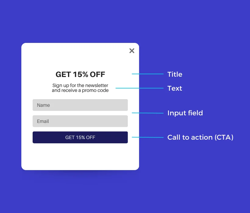
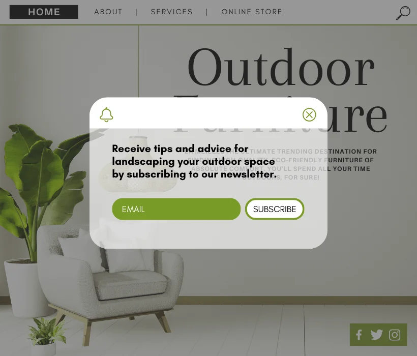
Title: Write a clear, simple, and concise title that highlights the benefits or added value of subscribing to your newsletter.
Text: Provide more details or an additional incentive to encourage newsletter sign-ups.
Input Field: Ensure that field labels are clear and understandable. Additionally, minimize the number of fields to fill in to encourage participation.
Button (CTA – Call to Action): Always present by default, visitors click on this button to subscribe or sign up. Opt for short words and action verbs.
Image: Add an image of the unique and appealing product or service offered to entice visitors to subscribe. This step is optional.
Color: Use a color palette that harmonizes with your website’s colors. Also, ensure that text and elements are easily readable with adequate contrast.
Size: Ensure that the pop-up size is suitable for the screen resolution, especially on mobile devices.
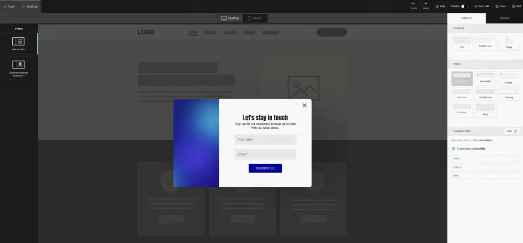
Here’s what creating a pop-up form looks like using Cyberimpact’s editor (note the subscription field settings):
Now, you have everything you need to create a pop-up form and provide a positive user experience while maximizing your conversions.

Try Cyberimpact: an email marketing platform with a high rating on Capterra. It lets you customize pop-up forms and integrate them into your website easily.
What is the effectiveness of pop-ups?
What is the effectiveness of popups? Marketers have been discussing the effectiveness of this strategy, as some people overuse it, which affects the user experience.
Using an exit-intent pop-up can help convert 2 to 4% more visitors into email subscribers and customers. It’s very annoying, and often, visitors end up leaving. However, when used appropriately and following best practices, pop-ups can help you increase your conversion rate.
Here are some interesting facts and statistics about pop-up forms:
- The most effective pop-ups display an average conversion rate of 9.28% (those who viewed a pop-up and took action).
- The average conversion rate for all pop-ups stands at 3.09%.
- The most successful pop-ups don’t appear immediately.
- Pop-up forms that convert the best are relevant to the visited web page.
- Unclear titles and offers will lead to a drop in your conversion rates.
- Using an exit-intent pop-up can help convert 2 to 4% more visitors into email subscribers and customers.
Strategies for a pop-up form
There are many different strategies when it comes to integrating a pop-up form on your website. Start by asking yourself the following questions:
- What is the main goal of the pop-up? Whether it’s collecting email addresses, promoting a special offer, lead generation, creating awareness for potential customers, etc.
- Who is the target audience for the pop-up? Identify the pop-up’s target audience based on the nature of the website and your marketing objectives.
- What type of information do you want to collect? Whether it’s an email, name, first name, phone number, or other relevant information.
- Is it worth interrupting your visitor’s browsing with a pop-up? If your pop-up doesn’t offer added value or doesn’t address a specific need, it may not be necessary.
1) Displaying your pop-up form at the right moment
You’ve probably had the experience of entering a store, and barely two steps in, a salesperson approaches you and asks, “Hello, how can I assist you today? Are you looking for something for a special occasion?”
While these questions can be helpful, bombarding a visitor with questions right upon entering can disorient them and make them want to leave the store.
For pop-up forms, it’s the same principle. Your website is similar to a shop. Therefore, it is crucial to determine the timing of the pop-up display. This should be based on the duration of a visitor’s stay on the site or the specific pages they browse. By doing so, the pop-up becomes more relevant and personalized for each individual.
Wait a few seconds before displaying the popup:
Start by analyzing how long visitors typically stay on your website or on specific pages. Based on your data, choose how many seconds to wait before displaying the form. For example, if people spend an average of one minute on your website, you could display your popup after 30 seconds.
Display the pop-up form when the visitor intends to leave:
When a visitor expresses the intention to leave the site, it’s often the last opportunity to capture their attention. A relevant pop-up at this stage can generate interest and prevent the potential loss of a lead or conversion.
Determine the display frequency:
Decide where to show the pop-up: Choose if the form should be on every page or just one specific page. You can decide to display the pop-up only once, on each visit to your website, once a month, etc.
Determine on which web page to display the pop-up: Decide whether the form should be present throughout the entire site or only on a specific page. For example, if your newsletter offers tips and advice, it would be wise to display the pop-up form when visitors arrive on your blog, indicating their interest in receiving information.
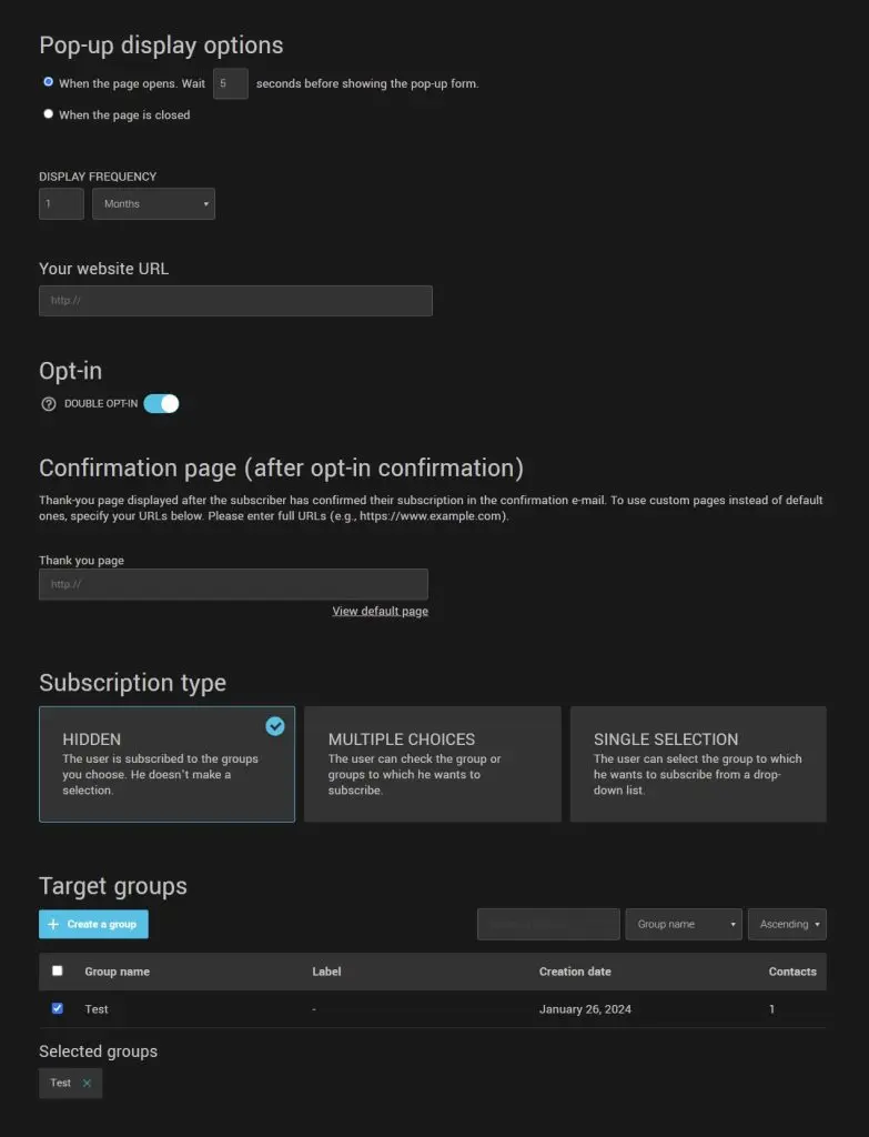
Here’s an overview of the display options available with Cyberimpact’s pop-up form editor:
2) Reduce the number of form fields
Reducing the number of form fields simplifies the process, making the user experience quicker and smoother. This approach increases the likelihood that visitors will complete the form. Additionally, as mentioned earlier, concise forms tend to have higher conversion rates.
Therefore, it is recommended to have as few fields as possible during the initial sign-up.
Once the user is registered, you can request any missing information that is genuinely necessary. It is crucial not to ask for data such as phone numbers or postal addresses if they are not essential to your business objective.
Especially with the advent of Law 25, transparency regarding the use of user data is imperative.
3) Determine the type of pop-up that works best for you
Determining the type of pop-up that works best for you depends on your goal and requires a deep understanding of your target audience. Is your goal to increase your contact lists? To boost your sales? To promote an event?
Here are some tips for each type of pop-up:
Subscription form:
- Use a simple pop-up with a visible subscription field.
- Offer an incentive, such as a discount or exclusive content, in exchange for the subscription.
- Limit the number of fields to fill out to encourage participation.
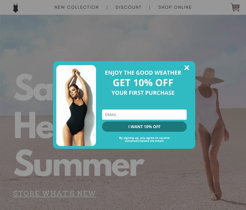
Promotion:
- Use an eye-catching design to highlight the promotional offer.
- Include a clear call-to-action (CTA) button to access the promotion.
- Use a countdown timer to create a sense of urgency.
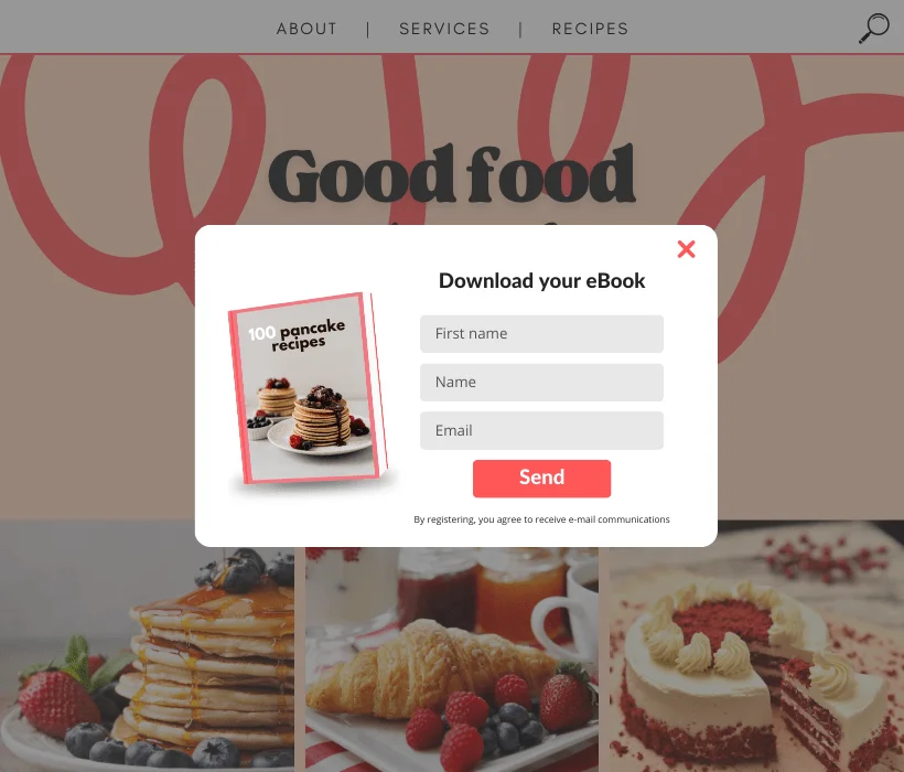
File download:
- Offer valuable content such as an e-book, guide, or infographic.
- Highlight the value of the downloadable file.
- Ensure that the download process is simple and quick.
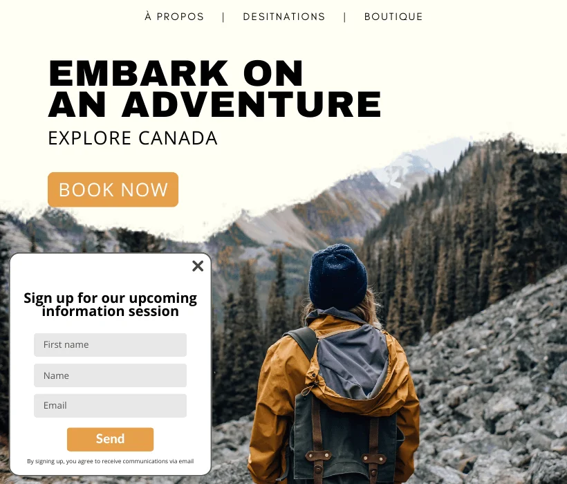
Event registration:
- Use a pop-up with a clear and concise registration form.
- Highlight the benefits and key features of the event.
- Include a reminder of the date and time of the event.
Purchase confirmation:
- Use a confirmation pop-up after the purchase to thank the customer.
- Offer complementary products or exclusive offers to encourage future purchases.
- Give specific information about the transaction, like saying that an email will be sent with the tracking number for delivery.
Feedback:
- Create a user-friendly pop-up inviting users to share their feedback.
- Limit the number of questions to encourage participation.
- Offer an incentive, such as a discount, in exchange for feedback.
4) Have a clear CTA
The purpose of a CTA (Call to Action) button is to encourage your visitors to take action. Therefore, it’s important that your button is easily noticeable within the window. Opt for colors that contrast with the rest of your window. For example, don’t use a yellow button with white text.
Furthermore, the CTA message should be clear and concise. Visitors must know what is expected to avoid confusion and encourage a positive response.
Here are some best practices to implement for a CTA and practices to avoid:
| Best Practices | To avoid |
|---|---|
| Use incentive language Example: “Save 20% today!” | Vague CTAs Example: “Explore the offer” |
| Use action verbs Example: “Download your free guide” | Lack of relevance Example: “Discover our story” |
| Be clear and concise Example: “Subscribe to the newsletter” vs. “Receive content several times a year” | Overly long CTAs Example: “Check out our fantastic deals in our newsletter!” |
5) Provide a clear incentive
Visitors should understand the value of what they will receive in exchange for providing their email address. The incentive can be a discount, contest entry, downloadable content like a whitepaper, case study, or practical guide. It could also be exclusive access to useful information, such as blog articles, educational videos, etc.
In summary, it’s important that the incentive is clearly stated to create a positive experience for visitors. This way, you are more likely to convert your visitors into prospects for your business. Moreover, being clear and transparent helps establish a trusting relationship.
Examples of pop-up forms
Now that you know everything you need to create converting pop-up forms, here are some real examples to inspire you.
Enter for a chance to win a gift card
Who doesn’t like the idea of winning a gift card? Offering the chance to win a gift card from your store in exchange for subscribing to your newsletter is an attractive and easy-to-implement incentive.
Dynamite brand gives chance to win $500 gift card by subscribing to their newsletter and text messages.

Getting a discount by subscribing to a newsletter
To stimulate immediate purchases, some companies take a different approach by offering a promotional code via email. This code gives a discount on a future purchase when you subscribe to their newsletter.
Clarins uses the FOMO strategy by adding a countdown timer to their pop-up form to create a sense of urgency.

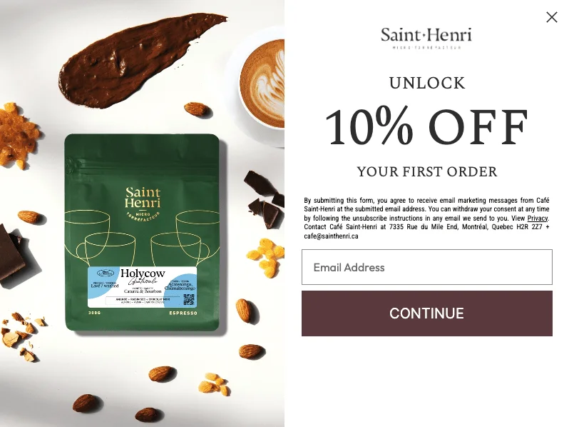
Café Saint-Henri offers a 10% discount on your order when you subscribe to their newsletter:
The women’s clothing store Reitmans has combined two incentives, the chance to win a gift card and a 15% discount on a first purchase. Also, the brand emphasizes other advantages of joining, like a birthday deal and exclusive access to promotions.

Offering brand-related information
Air Transat simply offers website visitors to subscribe to their newsletter to receive travel information, inspirations, or promotions:

Black Friday popup
Club Med offers its visitors to subscribe to their newsletter to receive exclusive Black Friday offers:

Popup and gamification
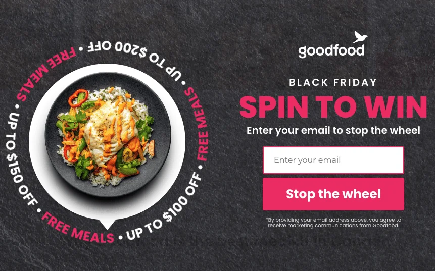
Goodfood has integrated a game into its popup form where you have to click on a wheel for a chance to win $100 worth of meals. Before participating, of course, you need to enter your email address and click on “Stop the wheel”:
Get started and create your first popup form
Popups are important for marketing. They can help with conversion rates, contact lists, and sales. To make the advice in our guide more relevant to your audience, customize it. Experiment with different methods and analyze the results. This will help you find the most effective popup for your business.
Lastly, remember to provide an incentive to your subscribers, as they expect something in return for their sign-up.
Create a pop-up subscription form with Cyberimpact
With Cyberimpact, you can easily design a pop-up that reflects your company’s colors and identity. You can integrate an image, customize the colors and text, choose the fields you want to include, such as email address, first name, last name, etc. Then, all you need to do is set the location and duration of the pop-up display on your website.