Table of Contents
A newsletter is more than just an email blast
Every day, our inboxes are overflowing. And yet, some newsletters manage to grab our attention within seconds. Is it the subject line? Sometimes. But more often, it’s the newsletter design that makes us want to keep reading.
As a graphic designer, I’ve had the chance to work on a wide range of projects — promotional newsletters in the automotive industry, remarketing campaigns, printed and digital ads… After plenty of testing, tweaking, and yes, a few flops, I’ve come to understand what truly catches the eye.
So here’s what I’ve learned, plain and simple, about creating a professional newsletter with a design that’s both effective and accessible. You’ll see — with just a few well-placed adjustments, the results can be surprisingly powerful.
Visual design directly impacts performance
You might have the best content in the world, but if your newsletter isn’t visually appealing, it’s likely headed straight for the trash folder. Newsletter design acts like an invisible guide — it draws the eye, leads the reader through the content, and encourages them to take action.
A strong design highlights your message without overwhelming it. On the other hand, a cluttered or poorly structured email with no clear focal point can tire the reader — and that’s rarely good for your click-through rate.
We sometimes forget that design is also a form of communication. Every visual choice you make matters: the color of a button, the alignment of your content blocks, the spacing between sections… These are the details that shape the reading experience.
The Ingredients of a Great Newsletter Design
A Clear Visual Hierarchy
Think of your newsletter as an inverted pyramid: the most important content should appear at the top, clearly visible. It’s not just a design principle — it’s a communication strategy.
With that in mind, don’t hesitate to use bold visuals, vibrant colors, or even place a character slightly off-center, breaking the traditional frame. These elements catch the eye, establish a visual anchor, and add rhythm to the reading flow. The goal is to surprise the reader, while naturally guiding their attention to the essentials.
Start with a strong, attention-grabbing headline. Follow it with a subheading that adds context, and then place a clear, visible call-to-action. Only after that should you dive into the secondary details.
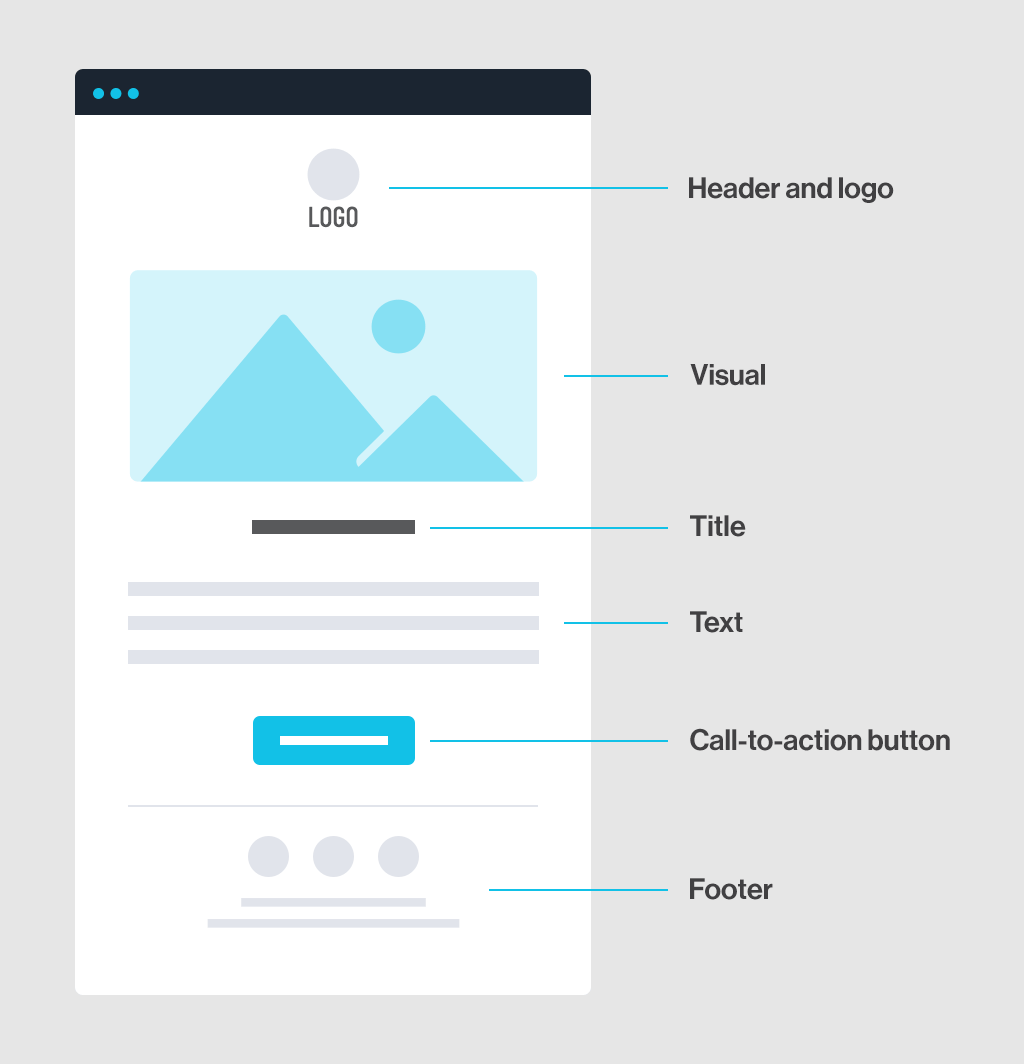
If everything looks equally important, the reader gets lost. A clear, top-down structure guides their eye and makes the content easier to read.
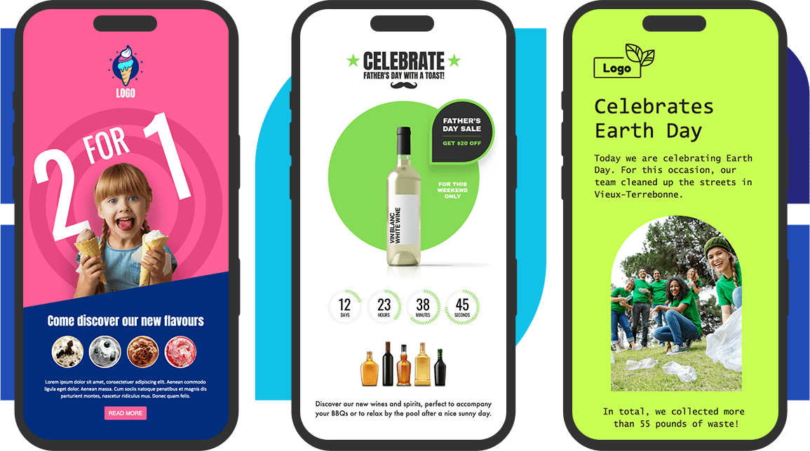
Visuals That Align With Your Brand (and Thoughtful Newsletter Design)
Your newsletter is an extension of your brand identity. Make sure to use the same colors, typography, and visual style as your website or social media channels.
A consistent visual language builds brand recognition and conveys professionalism.
For example, I once saw a travel industry newsletter that featured people smiling and enjoying the experience, instead of just showing a plane or a suitcase. The result? A message that felt more engaging, more human — and far more clickable. Showing the product in action creates the desire to live that experience.
And don’t forget: people increasingly want to see the human side of your brand. Highlight real people using your product or service, rather than just the product itself. An image that captures a lived experience will always speak louder than a static shot of packaging or features.
A Mobile-Friendly Layout
Most people read their emails on their phones. That means your design needs to be responsive — it should adapt seamlessly to any screen size.
➡️ Well-spaced blocks, buttons large enough to tap, and text that’s easy to read without zooming in are all non-negotiable.
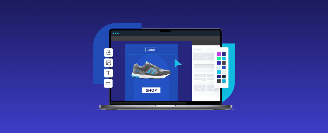
Fortunately, Cyberimpact makes this adaptation easy. Its editor offers blocks and templates that are already optimized for mobile, so you can focus on content and visuals — without worrying about the technical side.
Why Investing in Visual Design Pays Off
Newsletter design isn’t just about making things look good. In fact, newsletters with polished, thoughtful design can significantly increase click-through rates compared to plain-text emails. It’s a true performance lever. Studies show that well-designed emails not only get more clicks but also improve information retention.
And it’s not about budget. You can achieve great results with a simple yet intentional layout. The key is avoiding visual improvisation.
A strong design makes your message clearer, more enjoyable to read, and ultimately more effective. A well-structured email layout with smart visual elements can completely transform the reading experience. It’s an investment — one that delivers real, measurable results, because every visual detail helps amplify your message.
🎯 Conclusion – Every Detail Matters
Newsletter design remains a key element in any email marketing strategy. It directly impacts how your message is received, how much interest it generates, and what actions it inspires.
Before wrapping up, let’s take a moment to address a few frequently asked questions about newsletter design:
A well-crafted newsletter isn’t just about the message — it’s also about visuals that attract, a layout that breathes, and a seamless experience across all devices. Your reader makes a decision in just a few seconds. Good design can tip the scales in your favor.
And if you’re ready to go further, remember: you don’t have to do it all alone. Sometimes, just a few visual tweaks can completely transform how your brand is perceived.
FAQ – Newsletter Design
Why is design important in a newsletter?
Because it guides the reader’s attention, captures interest, and improves click-through rates. A good visual ensures your message is seen and understood more quickly.
What are the key elements of good newsletter design?
A strong headline, visuals that align with your brand, a clear layout, and a well-placed call-to-action.
How can I make sure my newsletter displays well on mobile?
Opt for a responsive design, add enough spacing between sections, adjust font sizes for readability, and use buttons that are easy to tap. Thankfully, platforms like Cyberimpact offer templates already optimized for mobile.
Do I need to hire a graphic designer to have a great-looking newsletter?
Not necessarily. Tools like Canva are great for getting started. That said, a professional designer can help you elevate your design faster and with better results.
By : Eric Boissonneault
Art Director, Motion Designer | Branding Specialist & Digital Strategist
“I boost marketing for tech and creative SMBs with impactful solutions.”