Did you know that readability can be measured? It’s an important factor in written communications and it can make a difference between being read or sent to trash.
Today we will tackle the editorial (content, structure) and visual (typography, layout) aspects of writing content for email marketing.
Are you looking for a quick readability reminder? We’ve got you covered at the end of this post.
It’s all about context
An email is not a post doctorate thesis. According to the analysis of real statistics, the average time spent reading an email is between 10 and 20 seconds (Litmus, 2016).
Why that? Well the reader is quite often busy with other tasks, or he’s reading on his cellphone at the kids swimming class, or he’s just arrived at work and has dozens of emails to sort through.
79% of readers don’t read text, they scan it.
Nielsen Norman Group
https://www.nngroup.com/articles/how-users-read-on-the-web/
To get his attention, you have to make it easy and give him a good reason to read more.
Optimize your content
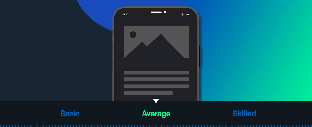
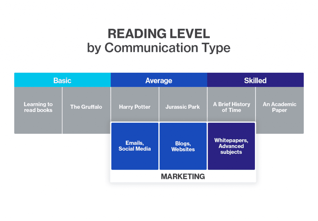
1. Use the appropriate reading level
Since 1920, several formulas have been developed to measure the ease of comprehension of a text. The result is usually a score based on a school grade.
For a text to be easily read and understood by a majority of readers (~ 80%), it must be around the high school or college level.
The general recommendations are as follows:
- Shorten your paragraphs – no more than 3 or 4 sentences;
- Keep your sentences short – 20 words maximum;
- Avoid unnecessarily complicated words and phrases.
Test yourself!
Before sending your email, check its score on tools like Flesh-Kincaid (english) or http://www.scolarius.com/ (french).
2. Prioritize your main message
Begin with your most important message and emphasize it. It should be easy to distinguish from lesser details. This is called the inverted pyramid technique.
If your email contains multiple topics, organize your ideas into small groups and use headlines to separate them.
3. Use content scanning to your advantage
Take inspiration from newspapers: first read by a fairly educated audience, around 1950 they began to experiment with their content to get more readers. Since then, they’ve been known for their organized layouts and catchy headlines.
The four main principles of designing for easy content scanning are as follow:
Prioritization
Divide your content into blocks: this makes it easier for the eye to understand the structure of the text.
Emphasis
Identify your most important content by putting it visually ahead of others. Use emphasis sparingly: if everything is highlighted, then nothing is.
White space
In print, every inch counts, but the space between the elements plays an important role too: it helps guide the eye. Leave more space around the highlighted content to distinguish it from others. White space also helps make text appear less dense and therefore makes it easier to read.
Consistency
Consistency helps scannability by making it easier for the eye to recognize “patterns”. Avoid using too many fonts or too many different colors. Keep a rhythm in the styles and choose carefully where you use the flashier effects.
4. Showcase your links
If your message contains an important link, display it as a button: it will be more visible. The text should be clear: it is always more tempting to click on “View our survey results” than on “click here”.
5. Be easy on the eyes
The smaller or longer a text is, the more visual effects applied to it can interfere with reading. It’s a legibility rule.
For example, script or fancy fonts are more difficult to decipher than simpler fonts, so reserve them for short, tall titles. Text in ALL CAPS or italics requires more effort to interpret and should be used sparingly.
Color contrast is also important: orange text on a white background can be difficult to read.
In terms of alignment, it is strongly suggested to avoid justified text, which breaks the rhythm of reading with uneven spaces between words.
Readability reminder
Before you hit “send”, make sure to check the following:
To do
- Readability score → easy to medium
- Short titles (1-2 lines)
- Paragraphs of 3-4 sentences maximum
- Sentences of 20 words or less
- Important content first
- Enough space between elements
To avoid
- Very long email
- Unefficient anchor text (ex.: click here)
- Low contrast between background and text
- Justified text, all caps or italics
- Too much visual noise
- Crowded, hard to distinguish content